how to colour grade
A simple and effective method to follow when colour grading footage in Davinci Resolve.
1. set up your colour management
Convert to Rec.709 - Use a Colour Space Transform (CST) node to convert your LOG footage to Rec.709. In my case, this node converts S-Log3 footage to Rec.709 gamma 2.2. The gamma to use depends on what your monitor is displaying. If you don't know, your monitor is probably displaying gamma 2.4.
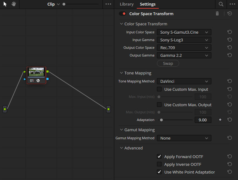
When colour grading, the Rec.709 conversion is one of the last steps in the pipeline, so it's counterintuitive to do it first. But we do this so we can view an accurate representation of our image.
This is always your starting point when colour grading.
2. make the basic corrections
Next we'll correct the exposure and white balance. Make two new nodes BEFORE the CST node.
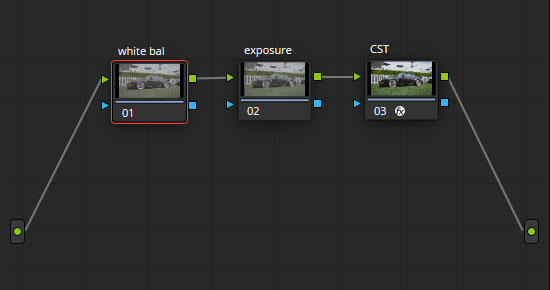
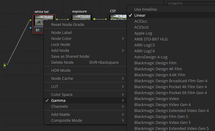
White balance - correct the white balance in the image. I prefer to do this by switching the Gamma of the White Balance node to Linear and using the Gain tool in the Primaries to correct any colour casts.
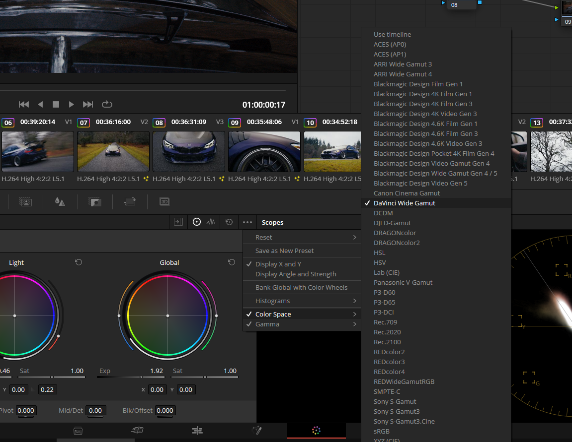
Exposure - make exposure adjustments to the image. I use the Global Exp slider in the HDR - Color Wheels tab. You can also make some contrast adjustments here.
Remember to set the correct colour space and gamma in your HDR tab, so Davinci knows how to correctly respond to your exposure adjustments. In my case, this is S-Log3.
3. creative looks
By now, you have a colour corrected, exposure corrected image which probably looks fine but not inspiring. Now that we have the basics out of the way, we can start developing the creative look.
What methods can you use to achieve that?
Colour boost - Add saturation to the image, increasing the intensity while keeping the colours rich and dense. The best method for this is a technique called subtractive saturation. There are many ways to achieve this. If you have the Davinci Film Look Creator tool, use the Subtractive Sat slider. Alternatively, I have created a filmic Colour Boost LUT which you can download and use for free. This works best in a node after your CST.
Split toning - another common way to add some contrast to your image, using a push-pull principle. Generally, this involves adding a teal tint to your shadows, and an orange tint to your midtones and highlights. Be very careful not to overdo this. It's best when its effect is subconsciously felt rather than consciously percieved.
Halation - use it sparingly. Halation is the subtle glow that film renders along bright edges in the frame. It's a result of light reflecting off the emulsion layers of film.
And that's all it really takes - no gatekeeping, no ads, no bs. If you found this guide useful, a like or follow on my Instagram would be much appreciated :)
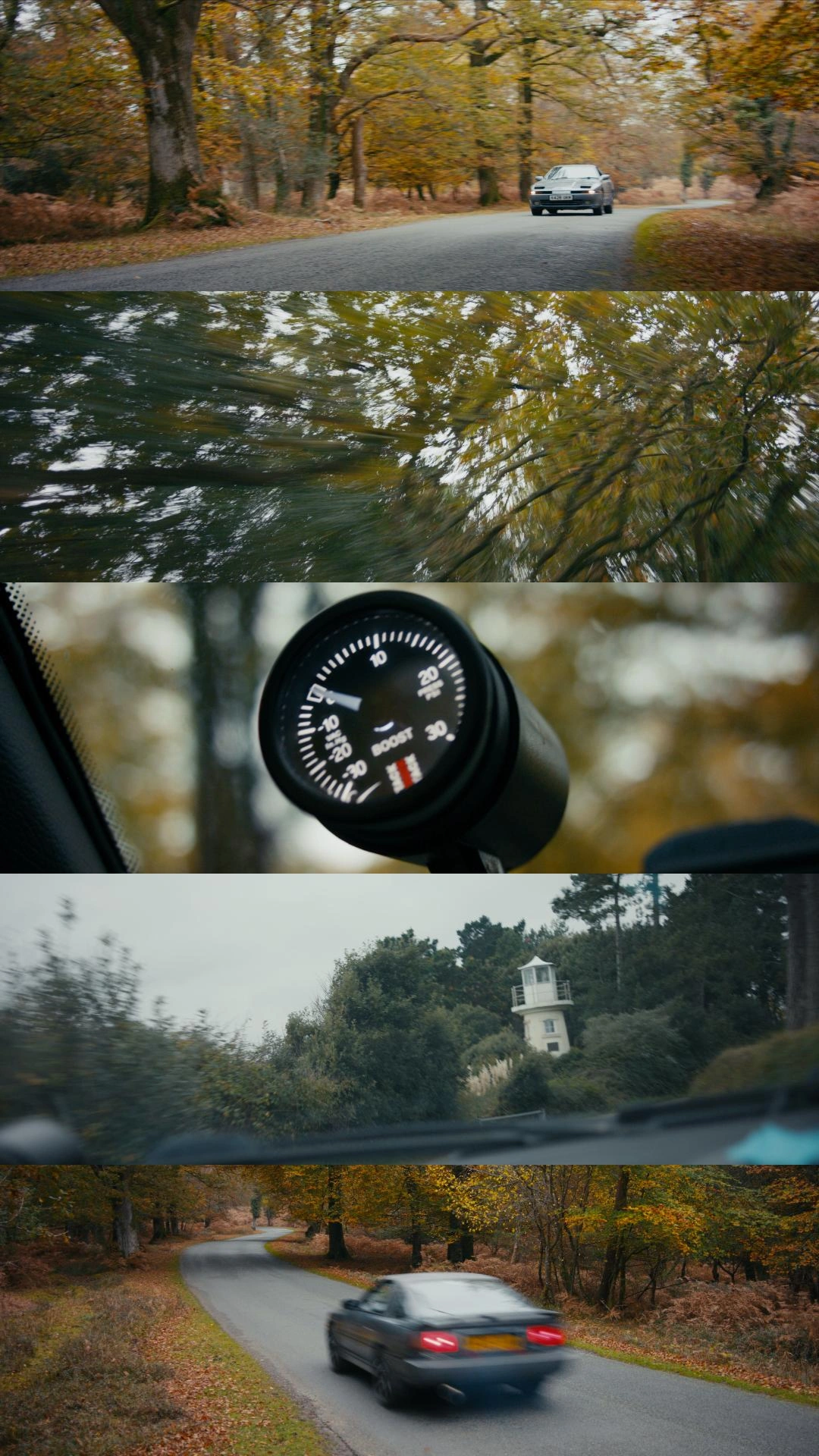
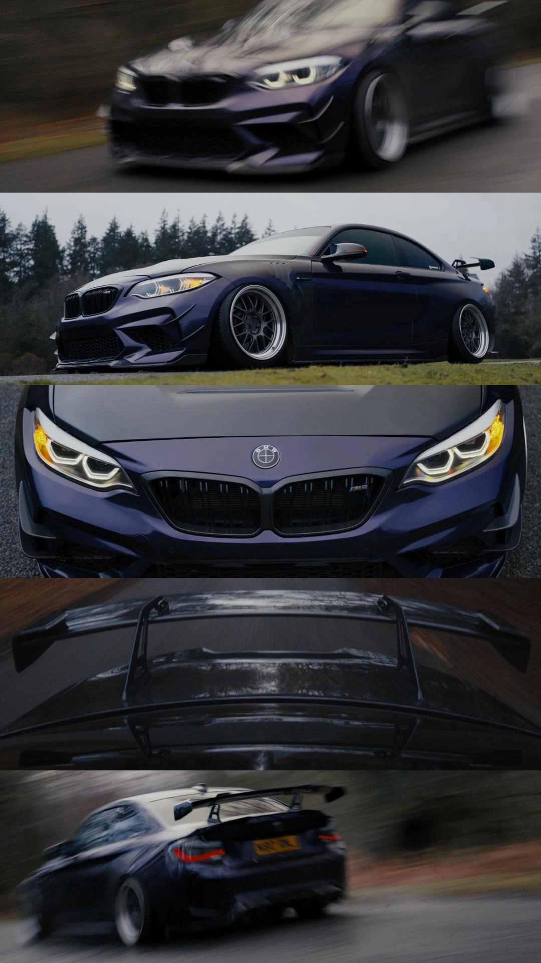
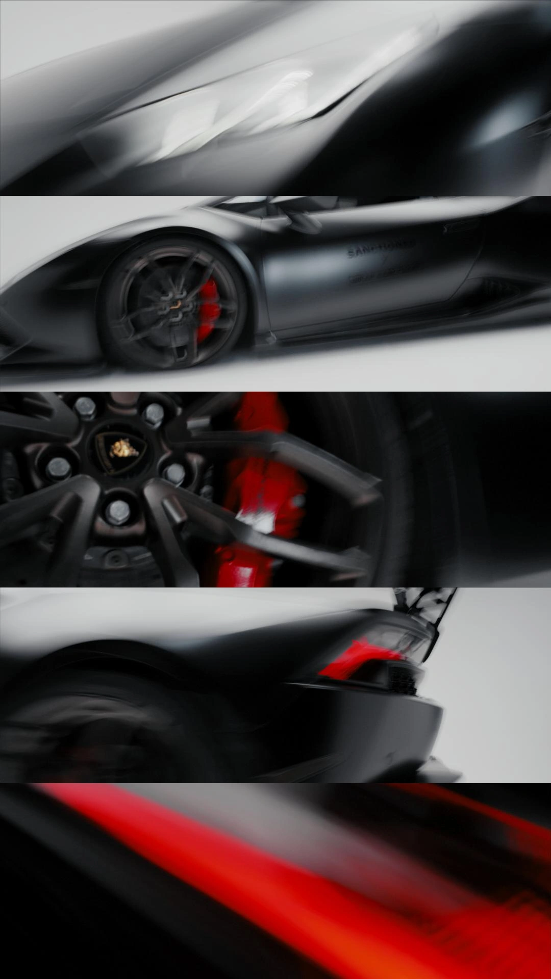
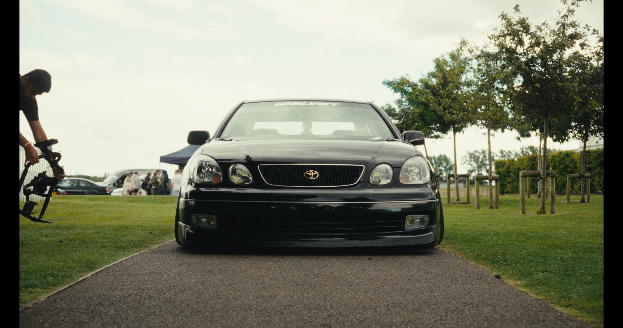
examples